

Main Menu
- Why Blakemore?
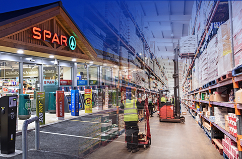
- Our Business
- The Blakemore Way
- Working in Partnership
- Local Marketing Partners
- Become a Supplier
- Meet the Trading Team
- News
Supplier Zone Menu 
SPAR Launches New Brand Positioning
January 12, 2022
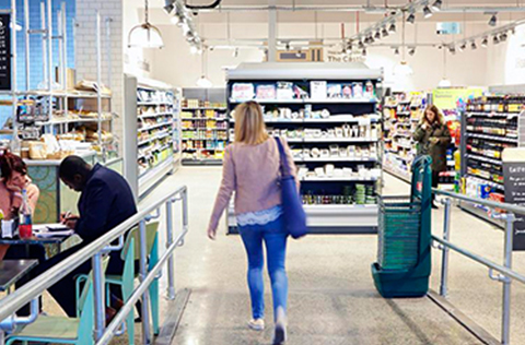
SPAR has unveiled a new UK-wide brand positioning that celebrates the unique characteristics of SPAR convenience stores.
The new brand positioning, called ‘The Joy Of Living Locally’, has launched in SPAR stores and across digital communication channels this January.
SPAR UK Brand & Marketing Director Suzanne Dover said: “Since 2020, we have looked at our brand to understand what it really means to our customers.
“At the same time, we have been in the middle of a pandemic, where our stores have been valued for meeting the needs of consumers for local convenience, availability of products and friendly services, when needed most.
“A unique characteristic of SPAR is that no two stores are the same, but all are supported by a core commonality – national SPAR own-label products, marketing, communications, promotions and store formats.
“This allows our independent retailers to build on a core framework and proposition. It ensures they can exercise their individual entrepreneurial skill and meet the needs of local shoppers in their stores.
“We saw that we needed to showcase what makes SPAR unique and the meaning behind our strapline ‘There for you’ and as a result ‘The Joy Of Living Locally’ brand positioning was born.”
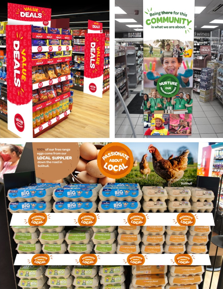
SPAR is using three new and distinct pillars to bring the positioning to life in-store. This will motivate shoppers and help them see how SPAR is different to other convenience retail brands. Everything SPAR now does as a brand will sit under one of these three pillars:
- Value on your doorstep
- Nurture our neighbourhoods
- Passionate about local
Each pillar will have its own distinctive creative badge, which will also be incorporated into future store designs and across all marketing collateral. The pillars will communicate to shoppers how SPAR adds value through promotional activity or everyday pricing, nurtures neighbourhoods by employing people from local communities, supports local causes and charities, celebrates neighbourliness, and showcases local food and producers through its ‘Passionate about local’ pillar. The pillars can work individually or can be brought together into a broader message.
A new bespoke typeface representing the spirit of the brand positioning, called the ‘SPAR scribble’, will be used in-store and on all communications, together with an expanded, distinctive colour palette complementary to the existing SPAR company colours of green, red and white.
All five SPAR wholesalers are sharing the new positioning and creative expression with independent retailers and company-owned stores. Brand guidelines, a retailer video and a toolkit have been produced to aid with execution.
Suzanne concluded: “We have taken ‘The Joy Of Living Locally’ into research and consumers love the new positioning and creative expression, saying that it is modern, progressive and a significant step forward for SPAR in the UK.
“Consumers have rapidly reassessed how they have used convenience stores over the past two years and they have told us that when we put the needs of the community at the heart of our offer, it is very motivating for them.”
The new look has launched in SPAR stores during January with the ‘Value on our doorstep’ pillar. The rebranding will be supported in-store and across all marketing collateral, including SPAR digital communications.


Supplier Zone News
January 04, 2024
January value at only £1.25 available from SPAR
December 23, 2022
Donations Worth £65,000 Awarded to Good Causes at Christmas
December 22, 2022
SPAR Alsager Relaunches with New Food to Go
View all Stories